Starbucks 12 app audit and affinity mapping
A 12-app competitive UX audit informing Starbucks’ APAC digital roadmap
The Problem & Context
Starbucks wanted to improve its mobile ordering and rewards experience in APAC, while aligning with global best practices. To achieve this, we needed to gain a wider view of what other players in the market were doing.
My Role & Methods
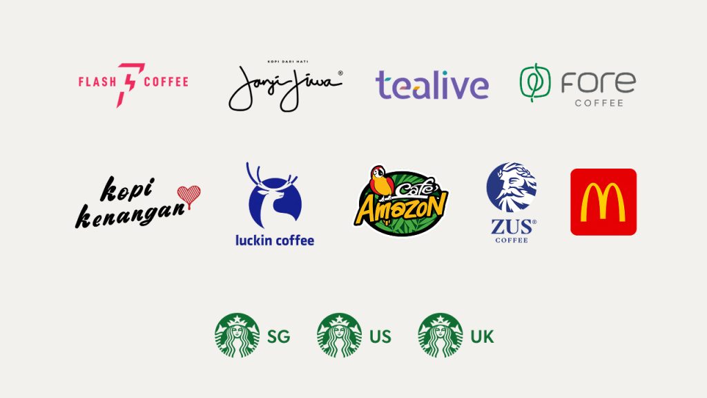
My task was to audit 12 competitor and peer apps across Asia, the US, and UK, and translate findings into actionable design recommendations. Selection of these apps were based on popularity in their respective countries, app store downloads and reviews, and UX contextualized for its menu items (i.e. Domino’s Pizza). We also deviated from super apps as their scopes were larger than the brand-specific product flows.
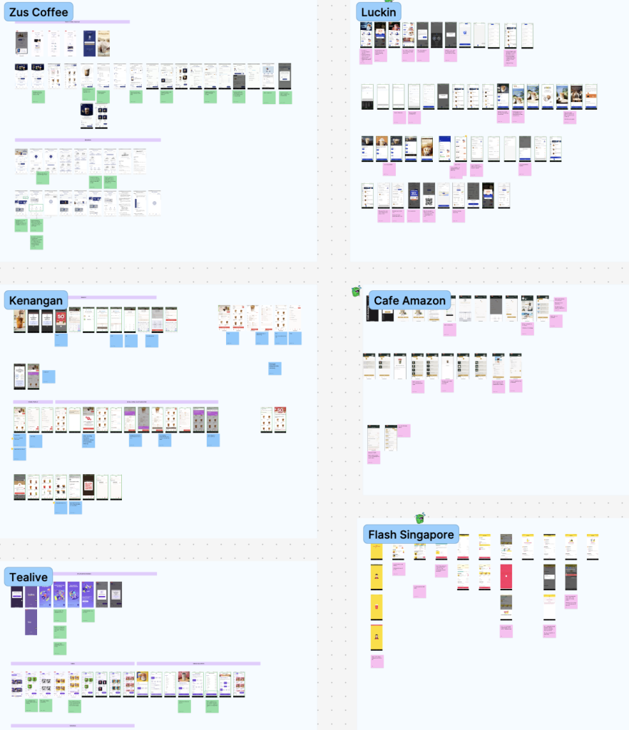
I conducted a competitive UX audit, heuristic analysis and insight affinity mapping across the end-to-end ordering journey from onboarding down to the post-purchase experience. I also helped supply supplementary wireframes to support these insights.
Research Insights
From 10 apps, I identified 4 key thematic patterns:
- A brand-forward, flexible sign-up for a persuasive opt-in
- Vertical + horizontal navigation for product discoverability
- Adaptive menus for personalization and upselling — product and season-specific
- Location/logistics dependence as a core user expectation
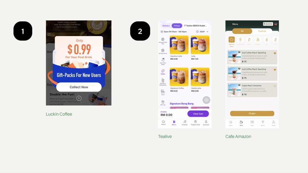
2. Tealive and Cafe Amazon with vertical and horizontal menus, respectively
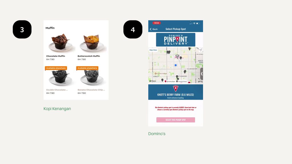
4. Domino’s combining branding with a location-based pickup flow
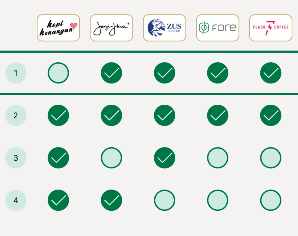
We listed among the 12 apps which displayed these themes. 6 of these displayed patterns aligned with at least 3 themes. Notably the US and Indonesia-based apps shone in this regard.
Supplementing these patterns, I also looked to contextualize the presentation later on in the client deck. For example, Kopi Kenangan has been regarded as more popular than Starbucks in Indonesia, through the audit we discovered that the app’s pleasant experience and menu items drew from Indonesian culture (even its humor) and even price points more appropriate for the market. Much of their UX writing was sprinkled with romance or heartbreak lines, which I found out later on was a tone Indonesians were fond of using.
While we did have little impact on the money-matter side of things, the rest of my insights contributed to the larger direction we saw the APAC food app segment was headed towards.
💡 On the UI aspect, pattern #2 was a personal favorite since it really challenged the conventional horizontal menus on mobile’s limited real estate without compromising flow, in fact enhancing it further.
Design Recommendations
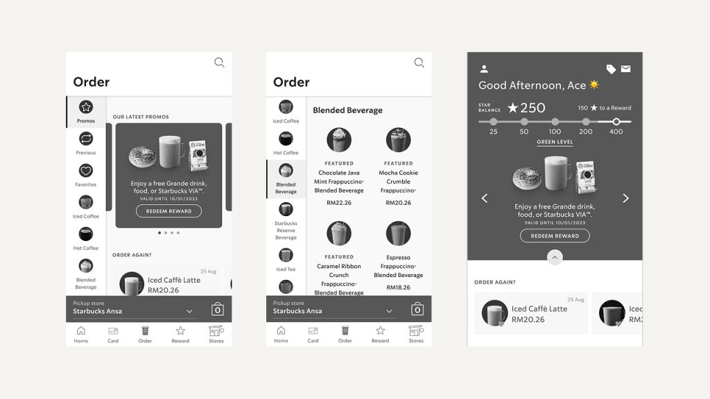
- Discoverability → increased item exposure or faster browsing.
- Potential impact: higher sales for least-ordered items,
- Customization → improved order accuracy or engagement.
- Potential impact: increased novelty mimicking the in-store experience, further strengthening loy
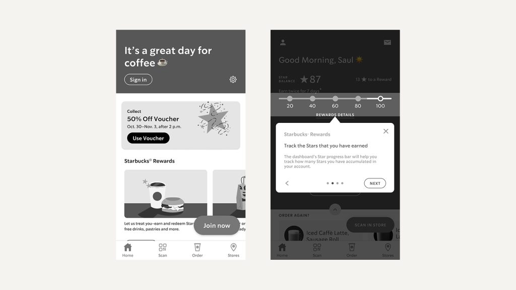
- Checkout & Payment → reduced friction → higher conversion.
Impact & Outcome
While this project didn’t proceed to implementation, the audit revealed clear opportunities for measurable improvement. These became pillars for KPI’s not just for Starbucks APAC’s coming year but also a framework I was able to repurpose and re-contextualize for future projects.
- Conversion uplift through more flexible onboarding and simplified checkout.
- Improved discoverability from adaptive menus and context-driven reorders.
- Increased retention by gamifying rewards and embedding post-purchase prompts.
These findings shaped Starbucks’ APAC digital roadmap and informed subsequent feature prioritization discussions.
Reflection / Takeaway
This project sharpened my ability to translate qualitative benchmarking into actionable, business-aligned design recommendations within a regional context. It also reinforced how important it is to present findings in a way that’s both data-driven and visually compelling for client stakeholders and user segments.

