Cool Material Website Redesign
Redefining an editorial brand with refined visuals, SEO integrity, and dynamic structure.
The Problem & Context
Cool Material — a men’s lifestyle and product discovery site — needed a design refresh that could modernize its visual identity without compromising SEO performance.
The site had grown around content-heavy templates and seemed like it had fallen behind more dynamic players in the digital publishing space. Despite that, their organic traffic was bringing them good numbers and they wanted to retain that, if not improve it further, with this redesign.
The redesign aimed to create a refined yet edgy aesthetic, introduce dynamic navigation and modular content systems, and ensure SEO continuity across thousands of legacy articles.

My Role & Scope
As the visual designer, I designed UI direction for the homepage, inner pages, and article system, and collaborated with a designer teammate for reviews and the site’s other screens. Alignment with the stakeholders and development team to align design decisions with SEO and publishing workflows was also constant throughout the project.
I drew from my experience in digital publishing at GRID Magazine (my previous job) to help define how structure and styling could support storytelling, search visibility, and any editorial revenue streams (e.g. affiliate product features, advertorials).
Responsibilities:
- Visual design studies and homepage layout architecture
- SEO-informed content hierarchy and text style system
- Article toolkit for editors with custom blocks and reusable patterns
Visual Design Studies
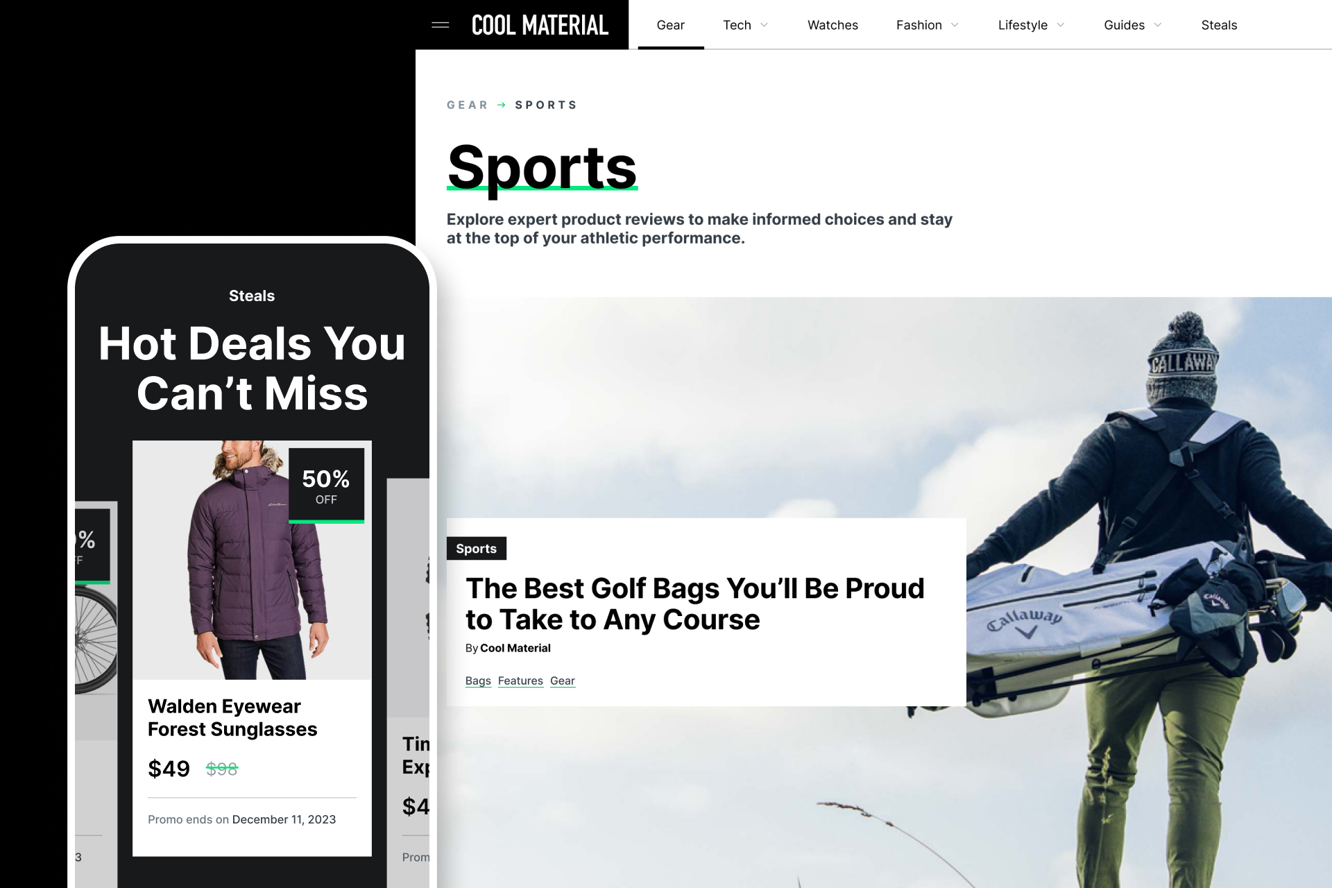
To evolve the brand’s look, a teammate and I explored different studies to match Cool Material’s brand voice and content. My studies focused on a minimal, high-contrast grid paired with strong typography and a bit of color as accent (we landed on a bright green).
The result balanced editorial polish with product-driven edge, this boiled down to a visual identity that could flex between style guides and gear reviews.
Visual goals:
- More distinct feature hierarchy between editorial and commerce sections
- Subtle motion on scroll for rhythm and pacing
- Elevated layout emphasizing photography and product framing for a magazine-like feel
Homepage Structure & Features
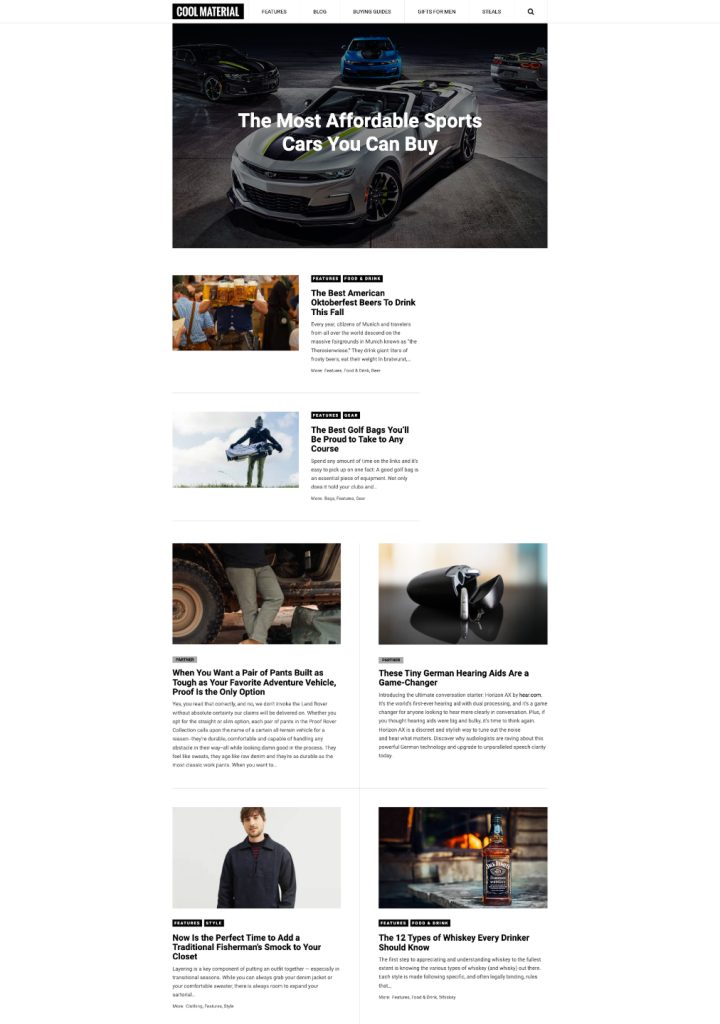
The new homepage restructured content around discoverability and rhythm:
- Featured Stories introduce hero content and key editorial pieces.
- Deals and Offers integrate commerce seamlessly into the editorial flow.
- Scroll interactions and dark/light contrast sections establish pacing while guiding attention.
- SEO strategy informed clear H1–H3 hierarchies, internal link sections (“Must Reads,” “From Our Partners”), and image optimization for search relevance.
- Responsiveness throughout different breakpoints ensured components and type scales were optimized for readability
This structure transformed the homepage into a content ecosystem — where stories, gear, and deals coexist fluidly.
Article Toolkit
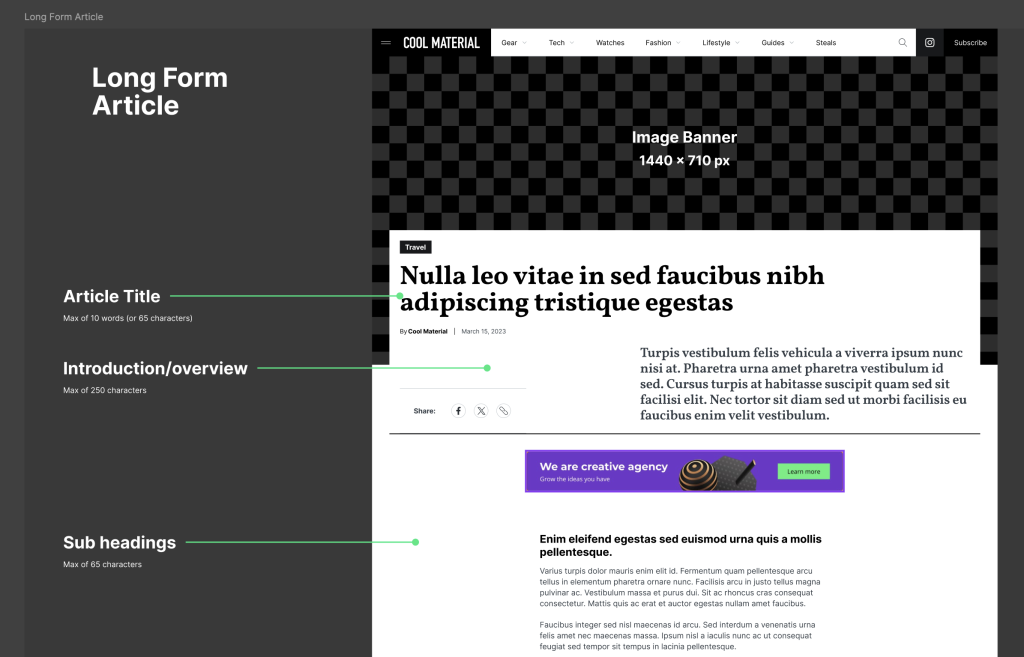
The article experience was rebuilt as a flexible publishing system for editors.
The new toolkit defines text styles, pull quotes, product grids, and image arrangements — all optimized for readability, scannability, and search performance.
Highlights:
- Text hierarchies aligned with SEO best practices (semantic H2–H6, structured paragraphs).
- Custom content blocks for curated product lists, affiliate links, and related features.
- Streamlined editorial process — fewer formatting errors, more visual consistency.
Example:
The Fall Style Guide 2025 feature showcases how modular blocks can express editorial tone while supporting product discovery and internal linking.

Impact & Outcome
While this project didn’t proceed to implementation, the audit revealed clear opportunities for measurable improvement. These became pillars for KPI’s not just for Starbucks APAC’s coming year but also a framework I was able to repurpose and re-contextualize for future projects.
- Conversion uplift through more flexible onboarding and simplified checkout.
- Improved discoverability from adaptive menus and context-driven reorders.
- Increased retention by gamifying rewards and embedding post-purchase prompts.
These findings shaped Starbucks’ APAC digital roadmap and informed subsequent feature prioritization discussions.
Reflection / Takeaway
This project sharpened my ability to translate qualitative benchmarking into actionable, business-aligned design recommendations within a regional context. It also reinforced how important it is to present findings in a way that’s both data-driven and visually compelling for client stakeholders and user segments.


